12 must-see new jerseys for the 2023 MLS season | MLSSoccer.com
By J. Sam Jones
@J_SamJones
We’ve now seen all 29 new kits for the 2023 MLS season. I’m not obligated or paid to say this, but it feels like the collaborative efforts here are improving every single year. Anyone still making “a league of plain white t-shirts” jokes probably thinks Vine still exists. The rest of the world has moved onto more civilized bits about it being “a league of city flag-based kits” while conceding city flag-based kits actually rule.
Anyway, the latest crop of kits is great but, as always, contains a few standouts. Some stand out on looks alone, some stand out for the collaborations behind them and some stand out for the simple fact the folks behind them just went for it and made something interesting.
Here are a few you’re gonna want to look at before seeing them on the field – starting with Matchday 1 on Feb. 25.
Daniel Patrick Kit
Some clubs look to symbols associated with their city and some leave it up to the fans, but not enough clubs look to designers to help them produce a kit worth paying attention to. The Red Bulls worked with luxury sportswear designer Daniel Patrick to push this one together and built a unique look for the club. It’s as good as the Red Bulls have looked separate from their primary color scheme.
The Bruce Lee Kit
It feels like the Sounders set the bar so high for this collaboration they were bound to get something excellent. I’m not sure how often adidas designers have been given guidance to the effect of “WE WANT A DRAGON KIT,” but I imagine they were pretty excited about the challenge at hand. They met the call here when the final product could have been wholly disappointing. Honestly, the whole concept worked out way better than you could have reasonably expected upon hearing the direction the Sounders were taking this.
Throw in the fact that few people who have existed are as cool as Bruce Lee and Seattle have a winner here.
The Man in Black Kit
One of the few people who approach the same coolness tier as Bruce Lee is Johnny Cash. So, Nashville collaborated with Cash’s estate to produce “The Man in Black Kit,” an all-black/metallic look that’s covered in tributes to one of the most successful and iconic musicians in American history. It’s as perfect a cultural fit for a kit as they come.
Nashville are going to pair this with their excellent in-stadium hype video to “God’s Gonna Cut You Down” and everyone involved is going to feel like they’re on the right timeline in the universe.
The Interboro Kit
Didn’t I tell you how some of these kits were going to be all about going for it? There aren’t many designs in this bunch quite as out there as NYCFC’s Interboro Kit. Does that mean I love the design? Well, I can’t decide yet, but maybe you do. Am I glad the design exists? Yep, for sure, I’ll always be ok with teams taking a risk on the primary look as long as they maintain their identity. This is clearly an NYCFC kit. And it’s their most distinct primary yet.
The 17’s Kit
Hey, speaking of maintaining identities… Atlanta United look like Atlanta United again. Which means Atlanta have one of the best looks in MLS again. With the gold collar and sleeves, they might have their best look in club history. I appreciate the swing back toward what’s correct and I’ll do my part to keep the BLVCK Kit from happening again.
A Kit For All
As good as Atlanta’s is, let’s get back to the folks taking wild swings at glory, please and thanks. I think this Chicago kit based on the city flag is outstanding and will look even better once the negative space on the front is filled in with, I dunno, a Mallort sponsorship or something.
The Fire took a risk here while still tying the look back into an identifiable part of their city’s iconography; it all ended up looking pretty excellent. Great work by all involved.
Las Voces Kit
Ok, yeah, could this one be accurately described as “Hey ChatGPT, design me an Austin kit?” Totally. But it also might be kind of great the more you look at it? I promise I’m not doing a bit.
Again, I’m always going to be a fan of taking big risks as long as you don’t deviate from your identity to the point of being unrecognizable. This is still absolutely an Austin kit, even if it makes you feel like if you squint for long enough it might make another smaller picture appear in the middle of the blur.
I think it’s one of those that looks great when it’s actually in use, but I totally understand if you disagree. Hey, at least it makes you feel something, right?
For Philly Kit
As always, the Union fan collective that helps design each kit came in and produced something solid. The whole design is good, but I truly love the minimal snake logo taking over for the crest. Less cluttered club crests on kits, more simplified logos.
New Day Kit
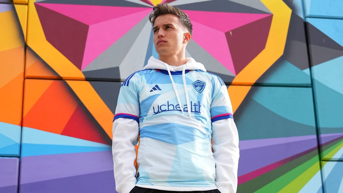
I mostly wanted to highlight this one for a moment thanks to Colorado’s wonderful collaboration with local artist Pat Milbery and their partnership with Mental Health Colorado (MHC) and UCHealth to bring attention to the current mental health crisis in Colorado, reduce the stigma of seeking help and amplify awareness of public resources. The club is also supporting mental health initiatives throughout the year, while also donating a combined $25,000 to various nonprofits serving mental health needs in the state, including MHC.
Supporting local art and another great cause is more than enough to make this one of the best new kits of the bunch (it also looks very cool).
The Cherry Blossom Kit
People have been asking for it for years and D.C. United finally got it. This one makes the list for simple fan service. Maybe a future edition of this concept is a little bolder, but there’s no denying this is still an excellent look.
The Northern Lights Kit
Gorgeous, builds on the team’s already-established identity and has local ties? This checks so many boxes. Like all the boxes. I love it. Even if the shorts and socks could’ve gone a bit bolder. The jersey itself is fantastic.
I don’t really have anything to add here. I just want to make sure y’all see these undebatably stellar primary kits.
I don’t really have anything to add here. I just want to make sure y’all see these undebatably stellar secondary kits.


Add Comment